Category Archives: Data Science

Clear and Obvious Analytics for Clear and Present Dangers

Not every industry has found their clear and obvious applications of big data analytics. But the clear and present dangers of risk and fraud in financial transactions demand fast predictive modeling. Precisely because we live in the ubiquitous digital era, where most business (and non-business) transactions are rarely (if ever) in analog form and those transactions no longer move at the pace of humans (but at the speed of light), consequently the volume of digital signals as well as lurking dangers is enormous.

Digital signals (from sensors everywhere in our operational business systems) carry transactional information (what happened to what?), as well as metadata (descriptors) and analytics information (data-encoded knowledge and insights).  These analytics can be behavioral (providing insights into the interests, intentions, and preferences of the actors in a given transaction) as well as functional (providing insights into the actions or events associated with the transaction).

Behavioral analytics is developing into a major component of digital marketing, as firms seek to sell, cross-sell, and up-sell their products to the right customer at the right time.  Behavioral analytics is also critical in risk mitigation of all sorts: financial, cybersecurity, health (individual and population), supply chain, machine performance, and so on.

Here are 10 examples of where fast predictive analytics can play a vital role in most industries (with a focus on financial):

  1. Predict credit risk and fraud in real-time!
  2. Use Social Media for deeper understanding (likes and dislikes) of your customers.
  3. Personalize customer interactions in real-time, across multiple channels.
  4. Stop improper insurance payments before claims are paid!
  5. Spot insurance rate evasion tactics during the quote process – before you issue a policy!
  6. Predict High Health Risk versus Low Health Risk to better manage healthcare decision-making.
  7. Generate better predictive models of health, car, and home insurance eligibility fraud, underwriting fraud, and improper payments.
  8. Spot adversarial and anomalous behavior in cyber networks – stop the data breach or illegal funds transfer before it happens!
  9. Eliminate your Supply Chain hiccups – move the right products to the right locations in the right quantities – and at the right time!
  10. Make better business decisions regarding merchandising, demand forecasting, and pricing – don’t leave money on the table, or products in your warehouse.

Let us look a little more closely at the financial services industry…

One of the common conditions in traditional financial services (including home, health, and auto insurance) has been the “pay and chase” — i.e., you make the payment to the claimant, and then (after making the payment) you find out that the claim is fraudulent, thus beginning the chase to get your money back.

The new world of predictive modeling and advanced analytics allows for a new mantra in the financial and insurance industries: “Do Not Pay!” — i.e., you do not pay the claim until you have analyzed its likelihood for claim fraud, extraordinary financial risk, or payment anomalies (e.g., duplicate payments).

Predictive analytics modeling delivers a better financial risk posture for your organization than the “pay and chase”. With access to greater and more diverse data sources, it is now possible to develop better models of your customers’ credit risk regardless of the industry. This is certainly true in the financial services industry where there is so much data available: credit scores, credit history, court records, tax records, health records, insurance claims, and more. There is no excuse for not examining as much “public data” as you can in conjunction with other data sources that are available to you internally within your organization. Moderate outlays of your organization’s funds that are incurred in acquiring access to diverse external data sources should be offset by the savings accrued by “not sending your funds out the door” erroneously (either to intentional fraudsters or in unintentional duplicate claims).

An analytics-driven predictive model can predict fraud more efficiently (with fast automatic statistical software packages) and more effectively (with higher precision and higher recall: fewer false positives and false negatives) than traditional business processes. A good predictive analytics model should: (a) detect claims that “smell funny”, (b) prevent the “pay and chase” mode of operations, and (c) stop claims fraud abruptly by empowering a “do not pay” mode of operations. Predictive analytics modeling should aim to satisfy the following business requirements:

  • Detect and prevent both opportunistic and professional fraud throughout the claims process.
  • Detect underwriting fraud, to prevent premium leakage at the point of sale and renewal.
  • Spot rate evasion tactics during the quote process – before you issue a policy.

Many more examples of use cases in the financial services industry (and elsewhere) where fast predictive analytics is important (and what you can do about it) have been expertly enumerated by the fast statistical modeling folks from Soft10, Inc. Check out their fast analytics products (including the Instant Online Overbilling Claims Detector) at http://soft10ware.com/.

Follow Kirk Borne on Twitter @KirkDBorne

A Growth Hacker’s Journey Through the Recent History of Data Science

In 1998, I was attending a conference when an astronomer that I knew from across the country sought me out and asked if his group could send the data from their large astronomy experiment to NASA’s ADF (Astrophysics Data Facility, where I was working at the time). Their data set was two Terabytes in total. That seemed big (like the birth of “Astronomy Big Data”) to me, especially for 1998, but I didn’t know how big until I went back to work a few days later. When I mentioned this opportunity to the NASA facility senior managers, they looked at me like I was unaware of something really obvious and important. They were right! They “reminded” me that the data facility was the home for 15,000 NASA space science mission data sets, and the aggregate sum total data volume for all of those data sets combined(!) was less than one Terabyte! They couldn’t possibly accept one single experiment’s data that single-handedly eclipsed the total volume of all of the other 15,000 experiments’ data sets combined.

Well, this was embarrassing! What could we do? I was told that ADF could accept the data if I would write a research grant proposal and win some funds to pay for all of the new I.T. resources that would be required. “What kind of research proposal would pay for such a thing?” I asked myself. This led me to investigate a field of research that I had only briefly heard in conversation once or twice previously — Data Mining (= Machine Learning applied to large data sets). The more I read about this topic (now called Data Science), the more I became convinced that this is what I wanted to do for the rest of my research career. I was hooked. I was at the right place at the right time…

(continue reading herehttps://www.mapr.com/blog/growth-hackers-journey-right-place-right-time)

Follow Kirk Borne on Twitter @KirkDBorne

These are a few of my favorite things… in Big Data and Data Science: A to Z

A while back, we made a list from A to Z of a few of our favorite things in big data and data science. We have made a lot of progress toward covering several of these topics. Here’s a handy list of the write-ups that I have completed so far:

AAssociation rule mining:  described in the article “Association Rule Mining – Not Your Typical Data Science Algorithm.”

C – Characterization:  described in the article “The Big C of Big Data: Top 8 Reasons that Characterization is ‘ROIght’ for Your Data.”

H – Hadoop (of course!):  described in the article “H is for Hadoop, along with a Huge Heap of Helpful Big Data Capabilities.” To learn more, check out the Executive’s Guide to Big Data and Apache Hadoop, available as a free download from MapR.

K – K-anything in data mining:  described in the article “The K’s of Data Mining – Great Things Come in Pairs.”

L – Local linear embedding (LLE):  is described in detail in the blog post series “When Big Data Goes Local, Small Data Gets Big – Part 1” and “Part 2

N – Novelty detection (also known as “Surprise Discovery”):  described in the articles “Outlier Detection Gets a Makeover – Surprise Discovery in Scientific Big Data” and “N is for Novelty Detection…” To learn more, check out the book Practical Machine Learning: A New Look at Anomaly Detection, available as a free download from MapR.

P – Profiling (specifically, data profiling):  described in the article “Data Profiling – Four Steps to Knowing Your Big Data.”

Q – Quantified and Tracked:  described in the article “Big Data is Everything, Quantified and Tracked: What this Means for You.”

R – Recommender engines:  described in two articles: “Design Patterns for Recommendation Systems – Everyone Wants a Pony” and “Personalization – It’s Not Just for Hamburgers Anymore.” To learn more, check out the book Practical Machine Learning: Innovations in Recommendation, available as a free download from MapR.

S – SVM (Support Vector Machines):  described in the article “The Importance of Location in Real Estate, Weather, and Machine Learning.”

Z – Zero bias, Zero variance:  described in the article “Statistical Truisms in the Age of Big Data.”

The Goldilocks Principle in Predictive Modeling and Data Science

In the field of statistics, there has been a lot written about statistical fallacies, logical fallacies, and fallacious reasoning. The following big list of fallacies is one that I like to use in my own undergraduate data science courses, particularly in my Data Ethics class where I teach my students about “lying with statistics”:

http://en.wikipedia.org/wiki/List_of_fallacies

Many of these fallacies are relevant to data science modeling, including this one: Circular Reasoning, where the reasoner “begins with what he or she is trying to end up with; sometimes called assuming the conclusion.”

A broken clock is truly an example of circular reasoning (as the dial is circular, and the clock represents a particular measurement in a repeating circular perspective): “Even a broken clock is right twice a day.”

(source: http://tvtropes.org/pmwiki/pmwiki.php/Main/StoppedClock)

In the following article, I use the broken clock analogy for circular reasoning in describing the importance of verification and validation in predictive analytics models: Are your predictive models like broken clocks? Here’s how to fix them.”  The article also discusses the importance of training vs. test data sets, the bias-variance tradeoff in data science modeling, underfitting vs. overfitting, and the Goldilocks Principle applied to data science.

(continue reading here) 

Follow Kirk Borne on Twitter @KirkDBorne
Learning from Data Big and Small — What’s the Shape of Your Data?

(A version of this article was originally published on BigDataRepublic.com in July 2013 — that site no longer exists.)

Does discovery depend on the scale of your experiment? In some cases, no! Whether Christopher Columbus sailed with 3 ships or 3000, he still would have found the New World, probably in the same amount of time. In this case, the existence of the Americas is independent of the scale of the exploration resources. Conversely, there are many more cases where the potential for discovery does scale with the size of your resources. If those resources are Big Data, then prepare to say “hello, world” to many more new worlds (and new discoveries). The good news for small-to-mid scale projects is that, even without Big Data, you can still be a Columbus.

Learning from small data has justifiably acquired a faithful following of advocates (see this and this).  Let us illustrate this with a common example: Time Series Analysis.

In a simple single-parameter data stream, you can extract characterizations from the time series: (a) the change since the last value (y2-y1); (b) a running mean (e.g., the average of the last 3 data points = [y1+y2+y3]/2); (c) the slope of the trend line (= velocity = dy/dt = [y2-y1]/[t2-t1]); (d) the rate of change of the trend line slope (= acceleration = the 2nd derivative of the data d2y/dt = {[y3-y2]/[t3-t2] – [y2-y1]/[t2-t1]} / [t3-t1] ); (e) the rate of change of acceleration (= jerk); and so on.

Stock market day traders watch 2nd derivatives more closely than the other time series characterizations, since that parameter can signal an inflection point in the data series. Inflection points (a change in the sign of the 2nd derivative) can thus be used as a predictor of an impending turn-around point (maximum = time to sell; or minimum = time to buy) in the time series.

These simple statistical metrics are therefore valuable and informative in some circumstances.  Somewhat more interesting characterizations include the shape of the variation: e.g., U, V, or W. These symbolic representations of temporal behaviors can be quite powerful for sequence mining, pattern discovery, transition detection, and trend analysis in time series data, as well as for the all-important dimensionality reduction and indexing of massive complex data streams.

If the time series stream of data is dense (in time), then you can do a spectral (frequency) analysis to measure the strength of patterns in the time series on all scales (high-frequency to low-frequency) — this is called Fourier Analysis. This analysis gives you a large number of characterization metrics (e.g., the frequency components and their amplitudes) for dense time series.  You can monitor these metrics and alert the end-user only when the power spectrum of the different frequency components changes significantly, even if the change is in only one component (e.g., its phase or amplitude) or if a new component appears (e.g., an hourly fluctuation in data that previously only showed daily fluctuation).

Finally, imagine massive parallel streams of data: Big Time Series Data. Now the fun begins! Such parallel streams may be Twitter timelines for hundreds of millions of users, or streaming data from hundreds (or thousands) of sensors in an airplane or manufacturing plant, or streaming transaction data from millions of retail shoppers or for a large financial firm. Monitoring massively parallel data streams in this way may be a perfect job for a distributed computing environment: Map-Reduce and Hadoop.

At each step (or within each incremental time range) of such massive data streams, you can create a data distribution histogram of the data values Y (or a histogram of trend line slopes dY, or of 2nd derivatives d2Y) across the full ensemble of parallel data streams. You can then estimate a variety of statistical metrics for the separate data distributions (i.e., one set of metrics each for Y, dY, d2Y, and others) as a function of time: mean, median, mode, variance, skew, kurtosis, presence of a long tail, mixture models, and more.  (Of course, if the data are textual, as in Twitter comments, then some form of numerical coding of the text will yield a goldmine of value – that’s a story for another article.)

Exploiting a variety of statistical metrics (data stream characterizations) such as these is where the exploration and discovery potential expands significantly. Similar to the small-data cases described earlier, the values of these characteristic statistical metrics on massive data streams become a model for the state of the system that you are monitoring. The model itself can be monitored and flagged for significant changes in these characteristic statistical features or for the appearance of new features in the data streams. As long as the massive parallel data streams continue to behave in predictable consistent patterns (which is called a “stationary state”), then there is no need to alert the end-user. However, when the stationarity of the data stream model changes (perhaps triggered by a change in any one of the state parameters that exceeds a pre-specified threshold), then a signal is raised and the end-user verifies whether a truly new behavior or event has been discovered. Land ahoy! All hands on deck!

The point of these examples is to demonstrate that discovery and learning from small data is still useful and valuable. As the data set becomes increasingly larger, it is then possible (and likely) that more intricate, subtle, and descriptive features within the data will be revealed. The discovery potential of bigger data thereby increases (perhaps exponentially). Additionally, the nature and diversity of the discoveries become richer, and maybe so will you!

Follow Kirk Borne on Twitter @KirkDBorne
Markov Models and Predictive Analytics with Cats

(A version of this article was originally published on BigDataRepublic.com in September 2013 — that site no longer exists.)

I have been teaching courses on data mining for over 10 years. One of my favorite lectures focuses on the use of Markov Models for predictive analytics. I enjoy giving this lecture because it always triggers interesting reactions from my students.  Since the lecture can be used to demonstrate advanced concepts (like Bayesian inference and probabilistic reasoning) as well as basic concepts (like conditional probability and statistical dependence), I use the lecture both in my graduate course and in my freshman class.  I start the lecture by telling the students that I will show them how to predict the future with a cat.

I begin my lecture with this question: how do you pronounce the word “cat”?  Before you stop reading this and ask “what does this have to do with data mining?” I will have to admit that my students also have a similar response, but they are my captive audience — they can’t go away — at least, they haven’t yet walked out on any of my lectures. 🙂  So, let us examine the cat question first, and then I will address the latent question “what does this have to do with predictive analytics or Big Data?”

Following the moments of confusion induced by my first question, I then bring the discussion back around to its data mining application with a second question: what are the phonemes (the perceptually distinct units of sound) that distinguish the word “cat” when you hear it spoken? We might think that there are 3 phonemes in “cat”: the “K”, “A”, and “T” sounds (phonemes P1, P2, and P3, respectively).  But, in fact, there are 4 phonemes — the 4th one (P4) being the momentarily brief “sound of silence” after the “T” sound.  That silent phoneme signals the end of the word, which is what clearly distinguishes “cat” from other words that begin with {P1,P2,P3} (e.g., catfish, catapult, Catalonia, catatonic).  This discussion reminds me of a riddle that might help to clarify my point: “Why can’t you die of hunger in the desert?” Answer: “Because of all the sand which is there” (which sounds a lot like “because of all the sandwiches there”, except for the very brief silence after the words “sand” and “which”).

Given a corpus of speeches (or speech fragments) for a specific person, you can build a comprehensive speech model that represents the words (specifically, the sequences of phonemes) that this person commonly uses.  The full distribution of conditional probabilities P[Pk|Pj] can be constructed, which then becomes the “model” for that person’s speech habits. [Note: the conditional probability expression P[Pk|Pj] refers to the transition probability that the phoneme Pk will occur immediately after the phoneme Pj has occurred.] The comprehensive speech model (i.e., the complete distribution of P[Pk,Pj] transition probabilities for a specific person) captures dialect, vernacular, peculiar pronunciations, utterances, and other recurring features in their speech (“ummm”, “you know”, “I mean”, etc.). These models are used in voice recognition software (and in our brains) both in verbal comprehension and in speaker recognition (i.e., unique identification = identifying a specific speaker, even if we can’t see them).  In this way, when you have a new voice sample, you can determine if it is consistent with the pattern of speech (the model) for a particular person.  Something similar to this was used to verify authenticity every time a new recording was released purporting to include the voice of Osama Bin Laden.

The important concepts in the “cat” example are the Markov Chain (which refers to the conditional sequence of data values) and the Markov Model (which is the model that is represented by the full set of conditional probabilities that characterize the Markov Chain).  A first-order Markov model is one in which the value of the next data point in the sequence is assumed to be statistically dependent only on the current data point.  In a second-order Markov model, the next data point is assumed to be dependent on the preceding two data points.  What is interesting and distinctive about Markov models is that most other statistical models rely on statistical independence of observed data points, whereas a Markov model (derived from and applied to Markov chains) absolutely and deliberately relies on the statistical dependence of the sequence of data points!

Therefore, we can apply Markov models in two complementary ways.  First, we can test whether an observed sequence of data values (e.g., the measured set of phoneme transitions within a speech) is consistent with a particular model (e.g., the set of transition probabilities for a known speaker).  Second, we can use the model as a predictor for what data value is likely to occur next in the sequence (i.e., use the model for predictive analytics).

In the era of Big Data, we can collect massive sequences of dependent data values (e.g., time series sequences of anything) for a large population of entities (e.g., customer purchase histories, web click logs, social events, human behaviors, speech patterns, weather reports, market quotes, device monitors, biosensors, video surveillance cameras, basketball play-by-play histories, etc.).  For each entity in the population, we can build a comprehensive Markov model.  If we do this for a full population of whatever it is that we are monitoring, we finally begin to fulfill one of the primary promises of Big Data: whole-population analytics.

From the historical training data that we have collected from all of our sources, we can construct and then use Markov Models to predict the future, including: tomorrow’s weather, or what products your customers are likely to buy, or the progression of an epidemic, or whether a cyber-attack is imminent, or whether LeBron James will pass the ball off in a 2-on-1 fast break.

Here is a simple predictive analytics example that uses a Markov model (i.e., the complete set of Markov chain transition probabilities) to predict the future.  Consider the following sequence of weather reports (a Markov chain) representing a series of 50 consecutive days (where S=sunny, R=rainy, and P=partly cloudy):

SSPPS PRRPP SSSPR RRRPS SSSPP PSSSS SPSSP PSPSS PRRPS SPRRR

This sequence has 3 possible states (S, R, and P).  We assume that tomorrow’s weather only depends on today’s weather — therefore, this represents a first-order Markov chain. We can then ask several questions. For example: (a) what is the most probable next state to follow after the end of this sequence? (b) What is the least likely next state to follow after the end of this sequence?  In order to answer such questions, we first calculate the full set of transition probabilities (the Markov model) from the above training data:

P(S|S) = 13/22

P(S|P) = 8/17

P(S|R) = 0

P(P|S) = 9/22

P(P|P) = 5/17

P(P|R) = 3/10

P(R|S) = 0

P(R|P) = 4/17

P(R|R) = 7/10

Therefore, we find: (a) the most probable next state after the end of this sequence is R (rainy day) since P(?|R) has the largest likelihood when ? is R; and (b) the least probable next state is S (sunny day) since P(?|R) has the smallest likelihood when ? is S.  Therefore, if the above sequence represents your weather for the past 50 days, then our first-order Markov model predicts that it will rain tomorrow, with 70% confidence.

In conclusion, we find that Markov modeling is powerful predictive analytics methodology, especially for Big Data CATS (Comprehensive Analysis of Time Series).

Follow Kirk Borne on Twitter @KirkDBorne

Where to get your Data Science Training or Apprenticeship

I am frequently asked for suggestions regarding academic institutions, professional organizations, or MOOCs that provide Data Science training.  The following list will be updated occasionally (LAST UPDATED: 2018 March 29) .

Also, be sure to check out The Definitive Q&A for Aspiring Data Scientists and the story of my journey from Astrophysics to Data Science. If the latter story interests you, then here are a couple of related interviews: “Data Mining at NASA to Teaching Data Science at GMU“, and “Interview with Leading Data Science Expert“.

Here are a few places to check out:

  1. The Booz Allen Field Guide to Data Science
  2. Do you have what it takes to be a Data Scientist? (get the Booz Allen Data Science Capability Handbook)
  3. http://www.thisismetis.com/explore-data-science-online-training (formerly exploredatascience.com at Booz-Allen)
  4. http://www.thisismetis.com/
  5. https://www.teamleada.com/
  6. MapR Academy (offering Free Hadoop, Spark, HBase, Drill, Hive training and certifications at MapR)
  7. Data Science Apprenticeship at DataScienceCentral.com
  8. (500+) Colleges and Universities with Data Science Degrees
  9. List of Machine Learning Certifications and Best Data Science Bootcamps
  10. NYC Data Science Academy
  11. NCSU Institute for Advanced Analytics
  12. Master of Science in Analytics at Bellarmine University
  13. http://www.districtdatalabs.com/ (District Data Labs)
  14. http://www.dataschool.io/
  15. http://www.persontyle.com/school/ 
  16. http://www.galvanize.it/education/#classes (formerly Zipfian Academy) includes http://www.galvanizeu.com/ (Data Science, Statistics, Machine Learning, Python)
  17. https://www.coursera.org/specialization/jhudatascience/1
  18. https://www.udacity.com/courses#!/data-science 
  19. https://www.udemy.com/courses/Business/Data-and-Analytics/
  20. http://insightdatascience.com/ 
  21. Data Science Master Classes (at Datafloq)
  22. http://datasciencemasters.org
  23. http://www.jigsawacademy.com/
  24. https://intellipaat.com/
  25. http://www.athenatechacademy.com/ (Hadoop training, and more)
  26. O’Reilly Media Learning Paths
  27. http://www.godatadriven.com/training.html
  28. Courses for Data Pros at Microsoft Virtual Academy
  29. 18 Resources to Learn Data Science Online (by Simplilearn)
  30. Learn Everything About Analytics (by AnalyticsVidhya)
  31. Data Science Masters Degree Programs

DataMiningTagCloudTagxedoWordCloud

Follow Kirk Borne on Twitter @KirkDBorne

Variety is the Spice of Life for Data Scientists

“Variety is the spice of life,” they say.  And variety is the spice of data also: adding rich texture and flavor to otherwise dull numbers. Variety ranks among the most exciting, interesting, and challenging aspects of big data.  Variety is one of the original “3 V’s of Big Data” and is frequently mentioned in Big Data discussions, which focus too much attention on Volume.

A short conversation with many “old school technologists” these days too often involves them making the declaration: We’ve always done big data.”  That statement really irks me… for lots of reasons.  I summarize in the following article some of those reasons:  “Today’s Big Data is Not Yesterday’s Big Data.” In a nutshell, those statements focus almost entirely on Volume, which is really missing the whole point of big data (in my humble opinion)… here comes the Internet of Things… hold onto your bits!

The greatest challenges and the most interesting aspects of big data appear in high-Velocity Big Data (requiring fast real-time analytics) and high-Variety Big Data (enabling the discovery of interesting patterns, trends, correlations, and features in high-dimensional spaces). Maybe because of my training as an astrophysicist, or maybe because scientific curiosity is a natural human characteristic, I love exploring features in multi-dimensional parameter spaces for interesting discoveries, and so should you!

Dimension reduction is a critical component of any solution dealing with high-variety (high-dimensional) data. Being able to sift through a mountain of data efficiently in order to find the key predictive, descriptive, and indicative features of the collection is a fundamental required data science capability for coping with Big Data.

Identifying the most interesting dimensions of the data is especially valuable when visualizing high-dimensional data. There is a “good news, bad news” perspective here. First, the bad news: the human capacity for seeing multiple dimensions is very limited: 3 or 4 dimensions are manageable; and 5 or 6 dimensions are possible; but more dimensions are difficult-to-impossible to assimilate. Now for the good news: the human cognitive ability to detect patterns, anomalies, changes, or other “features” in a large complex “scene” surpasses most computer algorithms for speed and effectiveness. In this case, a “scene” refers to any small-n projection of a larger-N parameter space of variables.

In data visualization, a systematic ordered parameter sweep through an ensemble of small-n projections (scenes) is often referred to as a “grand tour”, which allows a human viewer of the visualization sequence to see quickly any patterns or trends or anomalies in the large-N parameter space. Even such “grand tours” can miss salient (explanatory) features of the data, especially when the ratio N/n is large. Consequently, a data analytics approach that combines the best of both worlds (machine vision algorithms and human perception) will enable efficient and effective exploration of large high-dimensional data.

One such approach is to use statistical and machine learning techniques to develop “interestingness metrics” for high-variety data sets.  As such algorithms are applied to the data (in parameter sweeps or grand tours), they can discover and then present to the data end-user the most interesting and informative features (or combinations of features) in high-dimensional data: “Numbers are powerful, especially in interesting combinations.”

The outcomes of such exploratory data analyses are even more enhanced when the analytics tool ranks the output models (e.g., the data’s “most interesting parameters”) in order of significance and explanatory power (i.e., their ability to “explain” the complex high-dimensional patterns in the data).  Soft10’s “automatic statistician” Dr. Mo is a fast predictive analytics software package for exploring complex high-dimensional (high-variety) data.  Dr. Mo’s proprietary modeling and analytics techniques have been applied across many application domains, including medicine and health, finance, customer analytics, target marketing, nonprofits, membership services, and more. Check out Dr. Mo at http://soft10ware.com/ and read more herehttp://soft10ware.com/big-data-complexity-requires-fast-modeling-technology/

Kirk Borne is a member of the Soft10, Inc. Board of Advisors.

Follow Kirk Borne on Twitter @KirkDBorne

Standards in the Big Data Analytics Profession

A sign of maturity for most technologies and professions is the appearance of standards. Standards are used to enable, to promote, to measure, and perhaps to govern the use of that technology or the practice of that profession across a wide spectrum of communities. Standardization increases independent applications and comparative evaluations of the tools and practices of a profession.

Standards often apply to processes and codes of conduct, but standards also apply to digital content, including: (a) interoperable data exchange (such as GIS, CDF, or XML-based data standards); (b) data formats (such as ASCII or IEEE 754); (c) image formats (such as GIF or JPEG); (d) metadata coding standards (such as ICD-10 for the medical profession, or the Dublin Core for cultural, research, and information artifacts); and (e) standards for the sharing of models (such as PMML, the predictive model markup language, for data mining models).

Standards are ubiquitous.  This abundance causes some folks to quip: “The nice thing about standards is that there are so many of them.”  So, it should not be surprising to note that standards are now beginning to appear also in the worlds of big data and data science, providing evidence of the growing maturity of those professions…

(continue reading herehttps://www.mapr.com/blog/raising-standard-big-data-analytics-profession)

Follow Kirk Borne on Twitter @KirkDBorne

My Data Science Declaration for 2015

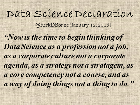
Here it is… my Data Science Declaration for 2015 (posted to Twitter on January 14, 2015):

“Now is the time to begin thinking of Data Science as a profession not a job, as a corporate culture not a corporate agenda, as a strategy not a stratagem, as a core competency not a course, and as a way of doing things not a thing to do.”

DataScienceDeclaration


Follow Kirk Borne on Twitter @KirkDBorne