Tag Archives: Statistics

Three Types of Actionable Business Analytics Not Called Predictive or Prescriptive

Decades (at least) of business analytics writings have focused on the power, perspicacity, value, and validity in deploying predictive and prescriptive analytics for business forecasting and optimization, respectively. These are primarily forward-looking actionable (proactive) applications. 

There are other dimensions of analytics that tend to focus on hindsight for business reporting and causal analysis – these are descriptive and diagnostic analytics, respectively, which are primarily reactive applications, mostly explanatory and investigatory, not necessarily actionable.

In the world of data there are other types of nuanced applications of business analytics that are also actionable – perhaps these are not too different from predictive and prescriptive, but their significance, value, and implementation can be explained and justified differently. Before we dive into these additional types of analytics applications, let us first consider a little pedagogical exercise with two simple evidence-based inferences.

(a) In essentially 100% of cases where an automobile is involved in an accident, the automobile had four wheels on the car prior to the accident.

(b) In 100% of divorce cases, the divorcing couple was married prior to the divorce.

What is the point of those obvious statistical inferences? The point is that the 100% association between the event and the preceding condition has no special predictive or prescriptive power. Hence, prior knowledge of these 100% associations does not offer any actionable value. In statistical terms, the joint probability of event Y and condition X co-occurring, designated P(X,Y), is essentially the probability P(Y) of event Y occurring. The probability of the condition X occurring, P(X), is irrelevant since the existence of the precondition X is implicitly present by default.

Okay, those examples represent two remarkably uninteresting cases. Even when similar sorts of inferences occur in a business context, they have essentially zero value. How do predictive and prescriptive analytics fit into this statistical framework?

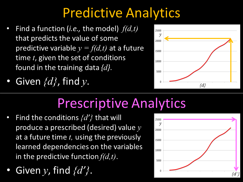
Using the same statistical terminology, the conditional probability P(Y|X) (the probability of Y occurring, given the presence of precondition X) is an expression of predictive analytics. By exploring and analyzing the business data, analysts and data scientists can search for and uncover such predictive relationships. This is predictive power discovery. Another way of saying this is: given observed data X, we can predict some outcome Y. Or more simply: given X, find Y.

Similarly (actually, conversely), we can use the conditional probability P(X|Y) (which is the probability that the precondition X exists, given the existence of outcome Y) as an expression of prescriptive analytics. How does that work in practice? By exploring and analyzing business data, analysts and data scientists can search for and uncover the conditions (causal factors) that have led to different outcomes. So, if the business wants to optimize some outcome Y, then data analysts will be tasked with finding the conditions X that must be implemented to achieve that desired outcome. This is prescriptive power discovery. Another way of saying this is: given some desired optimal outcome Y, what conditions X should we put in place. Or more simply: given Y, find X. Note how this simple mathematical expression of prescriptive analytics is exactly the opposite of our previous expression of predictive analytics (given X, find Y).

Here are a few business examples of this type of prescriptive analytics: Which marketing campaign is most efficient and effective (has best ROI) in optimizing sales? Which environmental factors during manufacturing, packaging, or shipping lead to reduced product returns? Which pricing strategies lead to the best business revenue? What equipment maintenance schedule minimizes failures, downtime (mean time to recovery), and overall maintenance costs?

Now that we have described predictive and prescriptive analytics in detail, what is there left? What are the three types of actionable (and valuable) business analytics applications that are not called predictive or prescriptive? They are sentinel, precursor, and cognitive analytics. Let’s define what these are.

  1. Sentinel Analytics – in common usage, the sentinel is the person on the guard station who is charged with watching for significant incoming or emergent activity. In practice, all activity is being observed and a decision is made as to whether any particular activity requires some sort of triage: sounding an alarm, or sending an alert to decision-makers, or doing nothing.
    • In the enterprise, sentinel analytics is most timely and beneficial when applied to real-time, dynamic data streams and time-critical decisions. For example, sensors (including internet of things devices and APIs on data networks) can be deployed with logic (analytics, statistical, and/or machine learning algorithms) to monitor and “watch” business systems and processes for emerging patterns, trends, behaviors, unusual operating modes, and anomalies that might be indicators of activities that require business attention, decisions, and/or action. 
  2. Precursor Analytics – in common usage, precursors are the early-warning indicators (harbingers, forerunners) of something else more serious or catastrophic that is about to come. We occasionally hear about earthquake precursors (increased levels of radon in groundwater), tidal wave precursors (a deep ocean earthquake), and cyber-attack precursors (phishing incidents). Precursor analytics is related to sentinel analytics. The latter (sentinel) is associated primarily with “watching” the data for interesting patterns that might require action, while precursor analytics is associated primarily with training the business systems to quickly identify those specific “learned” patterns and events that are known to be associated with high-risk events, thus requiring timely attention, intervention, and remediation. 
    • In these applications, the data science involvement includes both the “learning” of the most significant patterns to alert on and the improvement of their models (logic) to minimize false positives and false negatives. The analytics triage is critical, to avoid alarm fatigue (sending too many unimportant alerts) and to avoid underreporting of important actionable events. One could say that sentinel analytics is more like unsupervised machine learning, while precursor analytics is more like supervised machine learning. That is not a totally clean separation and distinction, but it might help to clarify their different applications of data science. 
    • The counterexample to the supervised learning explanation of precursor analytics is a “black swan” event – a rare high-impact event that is difficult to predict under normal circumstances – such as the global pandemic, which led to the failure of many predictive models in business. Broken models are definitely disruptive to analytics applications and business operations. Paradoxically, the precursor was actually predictive in a disruptive anti-predictive sort of way, which brings us right back to P(Y|X), or maybe it should be stated as P(“not Y”|X) where X is the black swan event (i.e., the predicted outcome Y from existing models will not occur in this case). As such, the global pandemic serves as a warning (a harbinger of disruption) and consequently as a “training example” to businesses for any future black swans. 
  3. Cognitive Analytics – this analytics mindset approach focuses on “surprise” discovery in data, using machine learning and AI to emulate and automate the cognitive abilities of humans. The goal is to discover novel, interesting, unexpected, and potentially valuable signals in the flood of streaming enterprise data. These may not be high-risk discoveries, but they could be high-reward discoveries. How does that resemble human cognitive abilities? Curiosity! Being curious about seeing something “funny” that you didn’t expect, thereby putting a “marker” in the data stream: “Look here! Pay attention! Ask questions about this!” 
    • Cognitive analytics is basically the opposite of descriptive analytics. In descriptive analytics, the task is to find answers to predetermined business questions (how much, how many, how often, who, where, when), whereas cognitive analytics is tasked with finding the business questions that should be asked. Descriptive: find the right answers in the data. Cognitive: find the right questions in the data. Cognitive analytics can then be viewed as a precursor to diagnostic analytics, which is the investigative stage of analytics that answers the questions raised by cognitive analytics (“Why did this happen?”, “Why are we seeing this pattern in our data?”, “What is the business impact of this trend, anomaly, behavior?”, “What is our next-best action as a result of this?”, “That’s funny! What is that?”).

None of these descriptions of the 3 “new” analytics applications are meant to declare that these are completely distinct and different from the “big 4” analytics applications that we have known for many years (Descriptive, Diagnostic, Predictive, Prescriptive). But the differences between the “big 4” and the “new 3” are in the nuanced business applications of these analytics in the enterprise and in the types of inferences that the data scientists are asked to derive from the business data. 

Deploying these analytics in the cloud further expands their accessibility, democratization, enterprise-wide acceptance, broad advocacy, and ultimate business value. Blending automated analytics products (coming from the sentinel, precursor, and cognitive applications) with human-in-the-loop inquisitiveness, curiosity, creativity, out-of-the-box thinking, idea generation, and persistence can transform any organization into a data analytics powerhouse through an analytic culture revolution. This is more imperative than ever, as a global survey of analytics executives has revealed:

  • “Companies have been working to become more data-driven for many years, with mixed results.”
  • “Right now, the biggest challenge for organizations working on their data strategy might not have to do with technology at all.”
  • “Corporate chief data, information, and analytics executives reported that cultural change is the most critical business imperative.”
  • “Just 26.5% of organizations report having established a data-driven organization.”
  • “91.9% of executives cite cultural obstacles as the greatest barrier to becoming data driven.”
  • Reference: https://hbr.org/2022/02/why-becoming-a-data-driven-organization-is-so-hard

Where do organizations get help to overcome these challenges? Microsoft delivers what its clients need to help them grow their top line with cloud-based analytics. Microsoft’s cloud-based analytics products and services propel business insights, innovation, and value from enterprise data, with all of the dimensions of analytics applications brought into the game. Specifically, cloud analytics (accessing and inferencing on multiple diverse business datasets across business units) for a wide variety of enterprise applications can sharpen the workforce’s focus on value and growth, including: forward-looking insights through predictive, sentinel, and precursor analytics; novel recommendations; rich customer engagement; analytic product innovation; resilience through prescriptive analytics; surprise discovery in data, asking the right questions, and exploring the most insightful lines of inquiry through cognitive analytics; and more.

Microsoft Azure Cloud extends ease-of-access analytics to all, delivers increased speed to deployment, provides leading security, compliance, and governance – with price performance for any organization. Whether organizations are seeking scalability in their enterprise data systems, advanced analytics capabilities (including the “big 4” and the “new 3”), real-time analytics (essential value-drivers from streaming data, including IoT, network logs, online customer interactions, supply chain, etc.), and the best in machine learning model-building and deployment services, Microsoft Azure Cloud has you covered. To learn more about it, go to https://azure.microsoft.com/en-us/solutions/cloud-scale-analytics and bring actionable business analytics to higher levels of proficiency and productivity across your organization.

AI Readiness is Not an Option

This year, artificial intelligence (AI) has become a major conversation centerpiece at home, in the park, at the gym, at work, everywhere. This is not entirely due to or related to ChatGPT and LLMs (large language models), though those have been the main drivers. The AI conversations, especially in technical circles, have focused intensively on generative AI, the creation of written content, images, videos, marketing copy, software code, speeches, and countless other things. For a short introduction to generative AI, see my article “Generative AI – Chapter 1, Page 1”.

While there has been huge public interest in generative AI (specifically, ChatGPT) by individuals, there has been a transformative impact on organizations everywhere, both in strategy conversations and tactical deployments. Businesses and others are seeking to leverage generative AI to increase productivity (efficiencies and effectiveness) in nearly all aspects of their enterprise.

To support essential enterprise AI strategy conversations, here are 12 key points for organizations to consider within the context of “AI readiness is not an option, but an imperative”:

[continue reading the full article here]

Built for AI – https://purefla.sh/41oS2Dp

Generative AI – Chapter 1, Page 1

Anyone who has been watching the AI space this year, even peripherally, will have noticed the flaming hot story of the year—ChatGPT and related chatbot applications. These AI applications are essentially deep machine learning models that are trained on hundreds of gigabytes of text and that can provide detailed, grammatically correct, and “mostly accurate” text responses to user inputs (questions, requests, or queries, which are called prompts). Specifically, these are LLMs—large language models. It is imperative, not an option, for organizations (and for most individuals) to be aware of what is going on here—not only because it is all over the news, but because it could affect your future self.

When I said “mostly accurate,” I meant that sometimes the ChatGPT responses go way off target—people refer to these as “hallucinations,” which is basically a reflection of the statistical basis of the models (see below)—the application will generate some plausible-sounding, grammatically correct statements that are complete falsehoods, such as “Leonardo da Vinci painted the Mona Lisa in 1815” (which is a real example of an observed ChatGPT hallucination).

I tested ChatGPT with my own account, and I was impressed with the results. I prompted it with various requests, including: Write a short story on a specific topic, provide a layperson’s explanations of some complex deep machine learning concepts, create a lesson plan to learn a tough subject, create an outline for a blog on a particular topic (no, not this one), and provide some financial advice on particular investments (no, it did not provide specific advice, but it did offer warnings like NFA “Not Financial Advice” and DYOR “Do Your Own Research”). You can find my results on my Medium blog site.

LLMs are so responsive and grammatically correct (even over many paragraphs of text) that some people worry that it is sentient. Guess what? It isn’t. It is merely a very large statistical model that provides the most likely sequence of words in response to a prompt. It is effectively a galaxy-sized statistically rich version of text autocomplete on your smartphone’s text messaging app, which already delivers some highly probable guesses for the missing words in a text message like this one: “Due to a client deadline, I will be working late at the ____ this ____, so I will be home late for ____.” LLMs can respond to much more complex (but well-posed) prompts, such as lesson plans for education, content for a business presentation, code for a software task, workflow steps for an IT project, and much more.

In order to help people to create well-posed prompts, the new discipline of prompt engineering has arisen. It’s not hard to find many online guides to prompt engineering, including guides for very specific industries, business tasks, workplace applications, and context-dependent scenarios. You don’t need prompt engineering to find those guides—a simple web search should do the trick. And guess what? When web search engines were first created, it took a while for us to learn how to submit well-posed keyword searches. That scenario is being played out again with ChatGPT and prompt engineering, but now our queries are aimed at a much more language-based, AI-powered, statistically rich application. If you understand Bayes’ Theorem and Bayesian statistics, then you will understand me when I say that we are talking here about an enormously more enriched set of priors, likelihoods, and evidence to feed the LLMs—so, it should not be surprising that the posteriors are shockingly good for large text outputs (most of the time).

LLMs are a subset of the deep learning field of natural language processing (NLP), which includes natural language understanding (NLU) and natural language generation (NLG). Think of chatbots and you get the idea, just expanded to a much, much larger domain of AI-based conversation.

Computer vision (CV) is another subset of deep learning, specifically aimed at object/pattern detection, recognition, and classification in images (including still images and video sequences). ChatGPT and LLMs are examples of generative AI using NLP for text generation. Stable Diffusion, Midjourney, and Dall-E are examples of generative AI using CV for image generation. Oh, by the way, I asked the generative AI at Stable Diffusion to create some images to go with my short story (which you can find on my Medium blog).

Beyond the individual examples of generative AI (and its components, ChatGPT, Stable Diffusion, etc.) that we can all experiment with, the applications in the enterprise can be tremendously impactful and transformative for organizations and the future of work. Those next chapters in the story are being written right now.

Continue reading about Enterprise AI in these posts:

  1. AI Readiness is Not an Option
  2. Top 9 Considerations for Enterprise AI

Glossaries of Data Science Terminology

Here is a compilation of glossaries of terminology used in data science, big data analytics, machine learning, AI, and related fields:

Data Science Glossary

A tag cloud of data science and machine learning terminology

Variety is the Secret Sauce for Big Discoveries in Big Data

When I was out for a walk recently, I heard a loud low-flying aircraft passing overhead. This was not unusual since we live in the flight path of planes landing at a major international airport about 10 miles from our home. In this case, I thought to myself that the sound seemed more directly overhead and lower than normal as well as being suggestive of a larger than average jet aircraft.

I realized that in my one simple thought, I had made three different inferences from a single stream of data. The data stream was the audible sound of the aircraft. The three inferences were about the altitude (lower than normal), the size (larger than average), and the flight path (more overhead). When I looked up, my tri-inference hypothesis was confirmed. The plane was a very large, low-flying jet for a major overnight shipping company. The slightly unusual flight path may have been associated with the fact that these planes are probably instructed to land on a different runway at the airport than the usual commercial passenger airlines’ flights – consequently, the altitude and location were slightly different from the slightly smaller commercial passenger airlines that pass overhead every day.

This situation caused me to reflect on how often we can jump to conclusions, infer a hypothesis, and (maybe without as much proof as in this case) we assume that our conclusion is true.

For the modern digital organization, the proof of any inference (that drives decisions) should be in the data! Rich and diverse data collections enable more accurate and trustworthy conclusions.

I frequently refer to the era of big data as “the end of demographics”. By that, I mean that we now have many more features, attributes, data sources, and insights into each entity in our domain: people, processes, and products. These multiple data sources enable a “360 view” of the entity, thus empowering a more personalized (even hyper-personalized) understanding of and response to the needs of that unique entity. In “big data language”, we are talking about one of the 3 V’s of big data: big data Variety!

High variety is one of the foundational key features of big data — we now measure many more features, characteristics, and dimensions of insight into nearly everything due to the plethora of data sources, sensors, and signals that we measure, monitor, and mine. Consequently, we no longer need to rely on a limited number of features and attributes when making decisions, taking actions, and generating inferences. We can make better, tailored, more personalized decisions and actions. Every entity is unique! That marks the end of demographics.

Here is another example: suppose that a person goes to their doctor to report problems with painful headaches. That is a single symptom (headache pain) — a single data source, a single signal, a single sensor. However, one could imagine a large number of possible inferences from that one single signal. The headaches could be caused by insufficient sleep (sleep apnea), high blood pressure, pregnancy, or a brain tumor. Obviously, each one of these diagnoses carries a seriously different course of action and treatment.

In “data science language”, what we are describing are different segments (clusters) in the hyperspace of symptoms and causes in which the many causes (clusters) are projected on top of one another (overlap one another) in the symptom space. The way that a data scientist resolves that degeneracy (another data science word) is to introduce more parameters (higher variety data) in order to “look at” those overlapping clusters from different angles and perspectives, thus resolving the different diagnosis clusters. High variety data enables the discovery of multiple clusters, and eventually identifies the correct cluster (correct diagnosis, in this case).

Higher variety data means that we are adding data from other sensors, other signals, other sources, and of different types. Going back to our low-flying airplane example, this has the following application: I not only heard the aircraft (sound = audio data), but I also looked at it (sight = visual data) and I observed its flight path (dynamic change over time = time series data). The proof of my inference about the airplane was in the data! Additional data sources provided the variety of data signals that were needed in order to derive a correct conclusion.

Similarly, when you go to the doctor with that headache, the doctor will start asking about other symptoms (e.g., lack of appetite; or other pains) and may order other medical tests (blood pressure checks, or other lab results). Those additional data sources and sensors provide the variety of data signals that are needed in order to derive the correct diagnosis.

These examples (low-flying aircraft, and headache pain) are representative analogies of a large number of different use cases in every organization, every business, and every process. The more data you have, the better you are able to detect and discover interesting and important phenomena and events. However, the more variety of data you have, the better you are able to correctly diagnose, interpret, understand, gain insights from, and take appropriate action in response to those phenomena and events.

High-variety data is the fuel that powers these insights, because variety is definitely the secret sauce for bigger and better discovery from big data collections.

Follow Kirk on Twitter at @KirkDBorne

Discovering and understanding patterns in highly dimensional data

Dimensionality reduction is a critical component of any solution dealing with massive data collections. Being able to sift through a mountain of data efficiently in order to find the key descriptive, predictive, and explanatory features of the collection is a fundamental required capability for coping with the Big Data avalanche. Identifying the most interesting dimensions of data is especially valuable when visualizing high-dimensional (high-variety) big data.

There is a “good news, bad news” angle here. First, the bad news: the human capacity for seeing multiple dimensions is very limited: 3 or 4 dimensions are manageable; 5 or 6 dimensions are possible; but more dimensions are difficult-to-impossible to assimilate. Now for the good news: the human cognitive ability to detect patterns, anomalies, changes, or other “features” in a large complex “scene” surpasses most computer algorithms for speed and effectiveness. In this case, a “scene” refers to any small-n projection of a larger-N parameter space of variables.

In data visualization, a systematic ordered parameter sweep through an ensemble of small-n projections (scenes) is often referred to as a “grand tour”, which allows a human viewer of the visualization sequence to see quickly any patterns or trends or anomalies in the large-N parameter space. Even such “grand tours” can miss salient (explanatory) features of the data, especially when the ratio N/n is large.

Consequently, a data analytics approach that combines the best of both worlds (machine algorithms and human perception) will enable efficient and effective exploration of large high-dimensional data. One such approach is to apply Computer Vision algorithms, which are designed to emulate human perception and cognitive abilities. Another approach is to generate “interestingness metrics” that signal to the data end-user the most interesting and informative features (or combinations of features) in high-dimensional data. A specific example of the latter is latent (hidden) variable discovery.

Latent variables are not explicitly observed but are inferred from the observed features, specifically because they are the variables that deliver the all-important (but sometimes hidden) descriptive, predictive, and explanatory power of the data set. Latent variables can also be concepts that are implicitly represented by the data (e.g., the “sentiment” of the author of a social media posting).  

Because some latent variables are “observable” in the sense that they can be generated through a “yet to be discovered” mathematical combination of several of the measured variables, these are therefore an obvious example of dimension reduction for visual exploration of large high-dimensional data.

Latent (Hidden) Variable Models are used in statistics to infer variables that are not observed but are inferred from the variables that are observed. Latent variables are widely used in social science, psychology, economics, life sciences and machine learning. In machine learning, many problems involve collection of high-dimensional multivariate observations and then hypothesizing a model that explains them. In such models, the role of the latent variables is to represent properties that have not been directly observed.

After inferring the existence of latent variables, the next challenge is to understand them. This can be achieved by exploring their relationship with the observed variables (e.g., using Bayesian methods) . Several correlation measures and dimensionality reduction methods such as PCA can be used to measure those relationships. Since we don’t know in advance what relationships exist between the latent variables and the observed variables, more generalized nonparametric measures like the Maximal Information Coefficient (MIC) can be used.

MIC has become popular recently, to some extent because it provides a straightforward R-squared type of estimate to measure dependency among variables in a high-dimensional data set.  Since we don’t know in advance what a latent variable actually represents, it is not possible to predict the type of relationship that it might possess with the observed variables. Consequently, a nonparametric approach makes sense in the case of large high-dimensional data, for which the interrelationships among the many variables is a mystery. Exploring variables that possess the largest values of MIC can help us to understand the type of relationships that the latent variables have with the existing variables, thereby achieving both dimension reduction and a parameter space in which to conduct visual exploration of high-dimensional data.

The techniques described here can help data end-users to discover and understand data patterns that may lead to interesting insights within their massive data collections.

Follow Kirk Borne on Twitter @KirkDBorne

The Shuttle Challenger Disaster: Reflections and Connections to Data Science

The explosion of the space shuttle Challenger on Jan. 28, 1986, remains one of the worst accidents in the history of the American space program. Two other major fatal space program catastrophes also occurred within a few calendar days of the Shuttle Challenger disaster date: the Apollo 1 fire on January 27, 1967 that killed 3 astronauts, and the Shuttle Columbia disintegration on February 1, 2003 that killed 7 astronauts.

I shared some personal reflections of the Challenger event and its connections to data science in two articles. Here are excerpts from those two publications:

(1) Absence of Evidence is not the same as Evidence of Absence

In the era of big data, we easily forget that we haven’t yet measured everything. Even with the prevalence of data everywhere, we still haven’t collected all possible data on a particular subject. Consequently, statistical analyses should be aware of and make allowances for missing data (absence of evidence), in order to avoid biased conclusions. Conversely, “evidence of absence” is a very valuable piece of information, if you can prove it. Scientists have investigated the importance of these concepts in the evaluation of substance abuse education programs. They find that even though the distinctions between the two concepts (“evidence of absence” versus “absence of evidence “) are important, some policy decisions and societal responses to important problems should move forward anyway. This is an atypical case.

Usually the distinctions between the two concepts (Absence of Evidence versus Evidence of Absence) are significant influencers in decision-making and in the advancement of an area of research.

For example, I once suggested to a major astronomy observatory director that we create a database of things searched for (with his telescopes) but never found – the EAD: Evidence of Absence Database. He liked the idea (as a tool to help minimize redundant usage of his facilities for duplicate false searches in cases where we already have clear evidence of absence), but he didn’t offer to pay for it. Here is one science paper that has dramatically understood this concept: “Can apparent superluminal neutrino speeds be explained as a quantum weak measurement?” The paper’s full complete abstract: “Probably not.”

A more dramatic and ruinous example of a failure to appreciate this statistical concept is the NASA Shuttle Challenger disaster in 1986, when engineers assumed that the lack of evidence of O-ring failures during cold weather launches was equivalent to evidence that there would be no O-ring failure during a cold-weather launch. In this case, the consequences of faulty statistical reasoning were catastrophic. This is an extreme case that clearly demonstrates that “Absence of Evidence is not the same as Evidence of Absence” is an important statistical truism that we must never forget in the era of big data.

(read my full article at http://www.statisticsviews.com/details/feature/4911381/Statistical-Truisms-in-the-Age-of-Big-Data.html)

(2) A Growth Hacker’s Journey – At the right place at the right time

A few months after my arrival at the Hubble Telescope Science Institute in 1985, tragedy struck! In January 1986, the Shuttle Challenger exploded 78 seconds after launch, killing all 7 astronauts on board. As a young person who dreamed of working in astronomy and space sciences since I was 9 years old, I was devastated. It took weeks for the staff to recover from the trauma of that horrific day. To this day, I still get choked up when I watch the recorded video footage of the event. Three things became very clear during those after-months:

  • The Shuttle launches would not resume for several years (hence, the Hubble Telescope would be grounded for all those years) while NASA fixed the problems that led to the Challenger catastrophe, which meant that the Hubble team of scientists and engineers had a lot of years to evaluate and improve all of the telescope systems.
  • One of the systems that was in significant need of improvement was the administrator-oriented Hubble Data Management System, which was previously designed primarily for data management by data system administrators and not designed so much for scientist-friendly data access, exploration, and discovery — hence, during those post-Challenger years, fresh designs and plans were developed for a new “top of the line” scientist-oriented user-friendly Hubble Science Data Archive.
  • Another system was identified as needing total overhaul, even rewriting the entire code base from scratch, and that was the scientific proposal entry, processing, and reporting system — they needed someone new to do the job, someone with a fresh perspective, with database skills, user interface skills, programming skills, and strong familiarity with astronomy. Guess who satisfied all of those constraints?

(read my full article at https://www.mapr.com/blog/growth-hackers-journey-right-place-right-time)

Follow Kirk Borne on Twitter @KirkDBorne

big-hst

Outliers, Inliers, and Other Surprises that Fly from your Data

Data can fly beyond the bounds of our models and our expectations in surprising and interesting ways. When data fly in these ways, we often find new insights and new value about the people, products, and processes that our data sources are tracking. Here are 4 simple examples of surprises that can fly from our data:

(1) Outliers — when data points are several standard deviations from the mean of your data distribution, these are traditional data outliers. These may signal at least 3 possible causes: (a) a data measurement problem (in the sensor); (b) a data processing problem (in the data pipeline); or (c) an amazing unexpected discovery about your data items. The first two causes are data quality issues that must be addressed and repaired. The latter case (when your data fly outside the bounds of your expectations) is golden and worthy of deeper exploration.

(2) Inliers — sometimes your data have constraints (business rules) that are inviolable (e.g., Fraction of customers that are Male + Fraction of customers that are Female = 1). A simple business example would be: Profit = Revenue minus Costs. Suppose an analyst examines these 3 numbers (Profit, Revenue, Costs) for many different entries in his business database, and he finds a data entry that is near the mean of the distribution for each of those 3 numbers. It appears (at first glance) that this entry is perfectly normal (an inlier, not an outlier), but in fact it might violate the above business rule. In that case, there is definitely a problem with these numbers — they have “flown” outside the bounds of the business rule.

(3) Nonlinear correlations — fitting a curve y=F(x) through data for the purpose of estimating values of y for new values of x is called regression. This is also an example of Predictive Analytics (we can predict future values based upon a function that was learned from the historical training data). When using higher-order functions for F(x) (especially polynomial functions), we must remember that the curves often diverge (to extreme values) beyond the range of the known data points that were used to learn the function. Such an extrapolation of the regression curve could lead to predictive outcomes that make no sense, because they fly far beyond reasonable values of our data parameters.

(4) Uplift — when two events occur together more frequently than you would expect from random chance, then their mutual dependence causes uplift. Statistical lift is simply measured by: P(X,Y)/[P(X)P(Y)]. The numerator P(X,Y) represents the joint frequency of two events X and Y co-occurring simultaneously. The denominator represents the probability that the two events X and Y will co-occur (at the same time) at random. If X and Y are completely independent events, then the numerator will equal the denominator – in that case (mutual independence), the uplift equals 1 (i.e., no lift). Conversely, if there is a higher than random co-occurrence of X and Y, then the statistical lift flies to values that are greater than 1 — that’s uplift! And that’s interesting. Cases with significant uplift can be marketing gold for your organization: in customer recommendation engines, in fraud detection, in targeted marketing campaigns, in community detection within social networks, or in mining electronic health records for adverse drug interactions and side effects.

These and other such instances of high-flying data are increasingly challenging to identify in the era of big data: high volume and high variety produce big computational challenges in searching for data that fly in interesting directions (especially in complex high-dimensional data sets). To achieve efficient and effective discovery in these cases, fast automatic statistical modeling can help. For this purpose, I recommend that you check out the analytics solutions from the fast automatic modeling folks at http://soft10ware.com/.

The Soft10 software package is trained to report automatically the most significant, informative and interesting dependencies in your data, no matter which way the data fly.

(Read the full blog, with more details for the 4 cases listed above, at: https://www.linkedin.com/pulse/when-data-fly-kirk-borne)

Follow Kirk Borne on Twitter @KirkDBorne

Reach Analytics Maturity through Fast Automatic Modeling

The late great baseball legend Yogi Berra was credited with saying this gem: “The future ain’t what it used to be.” In the context of big data analytics, I am now inclined to believe that Yogi was very insightful — his statement is an excellent description of Prescriptive Analytics.

Prescriptive Analytics goes beyond Descriptive and Predictive Analytics in the maturity framework of analytics. “Descriptive” analytics delivers hindsight (telling you what did happen, by generating reports from your databases), and “predictive” delivers foresight (telling you what will happen, through machine learning algorithms). Going one better, “prescriptive” delivers insight: discovering so much about your application domain (from your collection of big data and information resources, through data science and predictive models) that you are now able to take the actions (e.g., set the conditions and parameters) needed to achieve a prescribed (better, optimal, desired) outcome.

So, if predictive analytics can use historical training data sets to tell us what will happen in the future (e.g., which products a customer will buy; where and when your supply chain will need replenishing; which vehicles in your corporate fleet will need repairs; which machines in your manufacturing plant will need maintenance; or which servers in your data center will fail), then prescriptive analytics can alter that future (i.e., the future ain’t what it used to be).

When dealing with large high-variety data sets, with many features and measured attributes, it is often difficult to build accurate models that are generally useful under a variety of conditions and that capture all of the complexities of the response functions and explanatory variables within your business application. In such cases, fast automatic modeling tools are needed. These tools can help to identify the minimum viable feature set for accurate predictive and prescriptive modeling. For this purpose, I recommend that you check out the analytics solutions from the fast automatic modeling folks at http://soft10ware.com/.

The Soft10 software package is trained to observe quickly and report automatically the most significant, informative and explanatory dependencies in your data. Those capabilities are the “secret sauce” in insightful prescriptive analytics, and they coincide nicely with another insightful quote from Yogi Berra: “You can observe a lot by just watching.”

(Read the full blog at: https://www.linkedin.com/pulse/prescriptive-analytics-future-aint-what-used-kirk-borne)

Predictive versus Prescriptive Analytics

Predictive Analytics (given X, find Y) vs. Prescriptive Analytics (given Y, find X)

Follow Kirk Borne on Twitter @KirkDBorne

Blogging My Way Through Data Science, Big Data, and Analytics

I frequently write blog posts on other sites.  You can find those articles here (updated March 21, 2016):

I also write “one-off” blog posts, such as these examples:

Follow Kirk Borne on Twitter @KirkDBorne